Over the course of about 14 months from October 2010 to November 2011 I illustrated roughly 200 pages for the graphic novel Witch Hunts: A Graphic History of the Burning Times, authored by Bram Stoker Award Winners Rocky Wood and Lisa Morton.
The graphic novel was published by McFarland and so far has received much critical acclaim of which I am most humbled. It was a lot of work, particularly given the fact that I had to draw the entire book in the evenings and on weekends due to my full time job.
 |
| Page 2 |
 |
| Page 1 |
It was an amazing challenge taking Rocky and Lisa’s scripts and interpreting their words and descriptions onto the page. About 99% of my illustrations made the grade but there were some pages and drawings which didn’t suit and were left out or altered.
For those interested in seeing how the book was pieced together, I propose to show you some of the missing pages and the original five pages used as a pitch to the publisher way back in October 2010. Also included is a completely different cover to the one that was ultimately published:
 |
| Page 3 |
These pages are from the original proposal to McFarland. The page 2 you see here is nothing like the one that was ultimately published. It was the problem page, but it was also in my opinion the most important page in the book. It was a page intended to summarise what the graphic novel was about. The problem arose because there was a lot of text and I was trying to be creative and it just didn’t work. This page was a still being adjusted right up until the deadline.
 |
| Page 4 |
The other issue is that I was initially responsible for the placement of text – thankfully McFarland took this over. Not that I wasn’t capable, but I really needed to concentrate on the art rather than adding the text on the computer. The interesting thing about pages 3, 4 and 5 is that a lot of the panels you see here were ultimately redrawn as larger versions. I was thinking too small and the opening chapter of the book had to be expanded to seven pages.
Obviously McFarland liked the pitch, but we had to go back to the drawing board and think big. We decided that it would be easier to have more full page illustrations to cater for the text. I felt the text was just as crucial in the telling of this book – just as much as my illustrations. Yes, some editing was done but I think there were still some 20,000 words in the book.
 |
| Page 5 |
This page, page 5, one of my favourite pages from the book, was changed a little at McFarland’s suggestion. Vines were added to separate the Adam and Eve from the peeping monk panel, but I also wanted to tie the two ‘realms’ together and ended up drawing the maidservant holding Adam’s hand.
All in all the five page proposal was a very exciting challenge that dictated how the rest of the graphic novel would look. I wanted to capture that medieval engraving/etching look and I’m glad I ended up going with this style.
The Missing Pages!


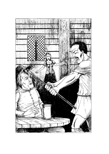
This is a page from chapter six where de la Case kills Master Jehan for accusing his daughters of witchcraft. The issue with this page was that I wasn’t depicting the “blow” de la Case delivered properly. It took a few roughs before I got it right.
The third rough captured it as it was intended.
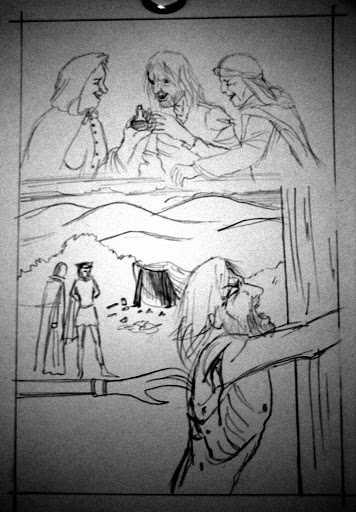
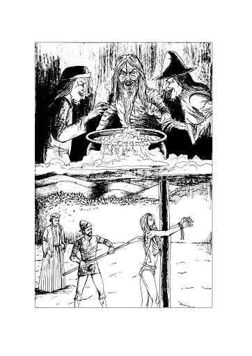 The page on the left here was changed because while you could see the man being tortured with the claw-like device, you couldn’t see who was doing it so I had to redraw it. The meeting between the man and the two witches also didn’t look sinister enough. The final page (right) actually turned out much better as I was able to merge the two different scenes into one so the reader’s eye could travel smoothly from top to bottom.
 |
| The original page 2 from the Valais chapter |
 |
| The final version of page 2 |
This page had to be completely redrawn as well because the intended focus was all wrong. In the first version I made the criminal prominent when it should have been the man and his wife in the foreground. This was simply a case of me misinterpreting the script.
It was a bit of a shame having to redraw it because I particularly liked how the soldiers clothes turned out.
And finally there’s the cover. I knew from the outset that I wanted to depict a witch being burned at the stake. At the very beginning of the project I drew this image:
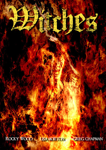
We all liked this image but over time we realised that the drawing of the woman was being lost in the flame (no pun intended there, I promise) so it was back to drawing board.
The next image was of the younger woman again, but in more of a full length body shot:

 The overall image was liked, but it was agreed that the woman wasn’t “witchy” enough and I was asked to make her much older. By this stage I had already inked the final image! But all it took was a little white gouache and the final cover was done!
Anyway I hope you all enjoyed reading about the evolution of Witch Hunts. If you’d like to purchase a copy you can find it via the following links:
Direct from the publisher – McFarland
You can also check out our website at www.witchhuntsbook.com where you can read more posts about the book’s creation and read reviews or visit our Facebook page!
We hope you enjoy reading it as much we all enjoyed creating it!
Discover more from DARKSCRYBE.COM
Subscribe to get the latest posts sent to your email.
